Monday, March 30, 2009

Defining Your Luxury: Keeping It Simple

You've heard the phrase: Keep It Simple Silly! (ok, I modified a little, but you get the picture)

The next step in defining your luxury and your home comes through editing. That is, don’t be afraid to clear the house of items that are not used or don’t suit the interiors. Who knows, hold a garage sale and maybe fund some of the changes you really want. It always amazes me when I make a comment about re-styling certain accessories to a client, how many times I hear "Well, I don't really like that anyway, but..." No buts. Here it is, I give you permission to move that object to another location or even out of your home. Would you constantly invite people into your home that you could not stand? Probably not. Then, why bring in and keep things in your home that you can not stand? To me it is a negative energy that you build in your home. Instead of smiling when you walk into your room, you frown. Be picky and choose carefully.

The second point of editing is controlling what, how and how much you display. A common issue is that we will inherit family heirlooms that we feel compelled to display – after all it was our Great Grandmother’s! What we forget sometimes is that displaying every bit of our 12 place settings in the china cabinet is too much for the eye to focus on at one time. Instead, chose a couple of settings to rotate through the year or display more of the larger serving pieces with 3 place settings. Invest in clear or metal frames that allow you to show a complete plate setting, most of these can be purchased at craft stores or online. This will give more limelight to the items, while carefully storing the remaining pieces. For those of us with multiple sets of china and crystal, try highlighting each set during a month, such as the birth month of the relative. Treat it as a revolving art showing in your home!

Another tendencies is to spread collections or accessories all over the place. So again, visually there is no stop points for the eye to focus on, just the same-looking pieces everywhere. Try grouping the accessories, usually into 3 or 5. It really becomes beneficial if there are height and detail variances that again add interest for the eye.

Don't believe me? Here is a case study for you. Look at this room that appeared in the April/May issue of Western Interiors (www.westerninteriors.com).

It is beautiful, isn't it? Regardless of whether your style is traditional or contemporary - there is just a peace to this composition. Notice the bookcase of relic jars. There are actually five there. But the other elements of color and material are simple as well and are in threes (use of stone, use of white) and the wooden sculpture is striking and of a large enough scale that it can stand alone. Now for the caption "The family room of a Beverly Hills, California, residence, 1978." This room by Michael Taylor is 31 years old. But the simplicity of the design and use of accessories has made it timeless. This is the effect that simplification can have in YOUR home.

Next Time: Building Your Base

Until then, It is Your Home, Your Style and Your Luxury.

Saturday, March 28, 2009

Defining Your Luxury

Welcome! Have you been in your home for a while, but it still isn't pulled together? Or maybe this is your first home and you find that you need it all. Where do you start? Or, what worked in your home 20 years ago just isn't making it into this century.


Then this posting is the first in a series meant to help you to bring luxury into your home. Please take a moment to follow us so that you will get our updates. I have work in this field for the past 7 years, after a career in marketing and advertising. I joined this profession because like many of you, I love to create beautiful homes for myself and my clients.


The subject of luxury is incredibly subjective person to person, for a mother of two, it maybe being able to escape to a air-jet tub at the end of the day. For another, it may be the feel of a leather chair while enjoying surround sound in the media room. As Americans, this century has brought more selection, more design focus and more choices of what to spend our money one, enabling us to bring luxury into our homes.

However, with more choices, most of us are a bit overwhelmed. Because not all items are created equally, it is hard to ensure that the money we spend on our home is spent wisely. That means by a quality project, that will last over the coming years. It is quite the task to compare products and quality at more that one store. So how do we bring it home?

The first, and perhaps the hardest step - Define what you find to be luxurious. According to the dictionary, luxury is defined as "indulgence in something that provides pleasure, satisfaction, or ease". Luxury transcends all types of styles. It implies a level of quality and is personal to you. But luxury is also in the details. It is how many of us can differentiate a Gucci purse from a knock off. It is also how when you know the tools, you can fool the eye and deflect attention away from a distraction.

Luxury also relates to the senses - the touch of Egyptian Cotton, the softness of chenille, the expertly framed artwork, the scent of a reed diffuser all add layers to your definition of luxury. Then the home entices the senses through sight, sound, smell or touch, it cements itself into your memory and the memory of your family. So is a walk-in shower with a rain head and body sprays your luxury? Or is the induction cook top that boils water in 90 seconds, leaving you more time to be with your family your luxury? How about entertainment - reading a novel, watching the latest movie releases in the comfort of your own home? Where do you and your family spend your time? What do you love? What do you not like? All of these answers factor into your definition.

Next Posting: Keeping It Simple

Wednesday, March 18, 2009

For Fun Friday

Ok, I admit, I've been light in the writing this week. But I've actually been writing for several other things, marketing materials and contributing to a book a colleague is writing. So I'm a bit written out. But since it is Friday and I love something a little fun on Fridays. I thought I'd share a picture from my garden this past summer. I was puzzled when my tomato plant went from leaves everywhere to no leaves at all on the top. Imagine my surprise when I stuck my head down, almost touching the little buggers and saw this.
Ok, I know they were eating my plants, but are they not beautiful? So if I can find the beauty in the worms, surely we can find something good to talk about in the world. No I did not kill them, but I did transplant them.

Sunday, March 15, 2009

Inspiration in the Simple Things

When most people travel, there are lots of pictures of themselves and their friends/family standing in front of something. My travel photos are full of things that catch my eye, make me laugh or that I think may inspire my work in the future. Take a look at some of these photos that I have taken over the last year or two.


This is the brick work on the sidewalks of Palm Springs. I love tile and working tile into patterns so this immediately caught my eye. Plus it is a detail that seems to be lacking from so many of our metropolitan areas.


This photo comes from a walk to the beach in Carmel. I took pictures of the house on the way down to the beach because as a composition, I loved it. On the way back to town, I stopped at the house again and marveled at the details. I didn't realize that it was the same house until my husband laughingly pointed it out to me.


I loved the iron leaves that serve as brackets for the pierced wood panels. Since Houston has several sources of wood panels this one really appealed to me.


One of my favorite photos was from a visit to NYC a couple of years ago during New Years. I loved this pavilion just at dusk. There is just a calmness to this scene to me. There are still rhythm and repetition, but it is simple and it calls to me.


Friday, March 13, 2009

Just for the Fun of It - Friday!


Well, I'll be enjoying a day with the two monkeys....so here is something fun for you. I saw in one of the shops in Palm Springs last month. Enjoy and have a great weekend!

Thursday, March 12, 2009

How to Choose Your Kitchen Appliances

When we start a project, the first run at the budget generally represents an "ideal" situation. From there, we work together with our clients to come to a more "realistic" budget. But, hey, that is why they call it planning.

One area that I do push my clients on is appliances. I believe that if you are going through the process to improve your kitchen, you really need to purchase the best technology out there. Let's face it, most of us don't remodel the kitchen every 5 or 10 years, so you really need to put the money in to making sure that the appliances you purchase today will not be dinosaurs in 10 years. Let's talk about one of my favorites for refrigeration - Sub Zero.

There are some products I believe that you pay for the name, but then there are some that you are paying (up front at least) for the technology. Sub Zero's refrigeration is pretty amazing, for many reasons. If you want to know more go to http://www.subzero.com/.


The air purification system, my favorite, helps to purify the internal compartment of various items such as ethylene. What is ethylene you may ask? It is the off gas from fruits and vegetable that promotes ripening. One of the worst producers is apples. Do you have an apple in your refrigerator? Well it is helping all the other fruits and veggies to ripen along with it.

It today's climate, I hate when I have to toss fruit or veggies due to over-ripening. Sub Zeros air purification system slows all of that down, extending the life of your produce. Don't believe me? My friend, Cathie has a 600 series Sub Zero. She says she just threw out a bunch of celery this week. But she bought the celery in the beginning of December. Hmm, that is 3 months. Think of how much you could save on your grocery budget with a Sub Zero in your house. I have two boys & a grown man in mine - I'm always looking for ways to do that!


Sub Zeros also last FOREVER! I'm sure there are cases where they don't, but I can't tell you how many kitchens were we update the Sub Zero not because it doesn't work, but because it is over 20 years old and just needs to be updated to fit with the rest of the kitchen. For most people it is a fight to get them to update them because they love the one they have.
Sub Zero is also making several new product and design introductions over the next couple of years. So when it is your turn to remodel your kitchen, think hard about your appliances. Buy the best you can and you'll be glad you did down the road.


Monday, March 9, 2009

For the Love of Something With Soul

OK, when it comes down to it, I'm probably a bit more down to earth than Madonna. But I would kill for those arms! And as much as I like my labels, I love sitting in the dirt with my boys. So, it is no wonder that I feel a heart string pull to older homes. I can't help it. I read articles about historical restorations and I get all sentimental. I am in the business. I am fully in tune with the meaning of restoration or renovation of an historical style, and still I get all romantic about it!

I blame my mother. My mother and This Old House. I was drawn to watch This Old House on PBS with Bob Vila, then Steve and Norm when it was the closest thing to an interior design show there was. And then being who I am, I watched New Yankee Workshop and The Victory Garden afterwards. It was entertaining to go back to school after a success stint in interactive and traditional marketing, to hear that fellows students favorite show was "Trading Spaces". No offense to the show or the talent. There are definitely ideas and talent there. But as I told my husband - "Do not put me on any show that redecorates in 24 or 48 hours!" I'd be afraid of what fell apart in the next 24 or 48 hours after everyone left.


Good design just takes time. And unfortunately, what most people don't see in the show is the time that it takes to put it together. It's not just a little....it's more than you think.

So as I ponder and research details for our little kitchen and how to bring in the right modern touches, I wax over the "good ol'days" when homes where built to last. I romanticize what it is like to live in a much older home and design my new kitchen to live.

I hope you are able to find your sunshine among the news of rainy days!

A Design Case Study: Windfarms & Palm Springs

As part of our short drive from Ontario Airport in LA to Palm Springs last month, we had the pleasure of driving through San Gorgonio Mountain Pass. This stretch of mountains is the third highest in California and the pass is a natural wind tunnel, with strong winds most of the year. This windfarm makes enough power to supply Palm Springs and the surrounding areas.


I was FASCINATED! As a resident of Texas, with family in Dallas, we often see semitrailers loaded with wind turbine parts. They are huge. But I had not seen a wind farm until we reached Palm Springs. This most amazing fact is that the tallest wind turbines are 150 feet tall, with the blades at 1/2 of a football field. When you are driving through, you sense they are big, but not that big.

The designer in me took great notice in how the use of three colors; white, black and grey, affected the landscape. See what you think -


The largest and all white ones are up on the ridge. The lower ones (medium) have a black "A" Frame structure - see how the bases disappear in the landscape?
These are my favorite color, grey. You can still see them, but they are more subtle in the landscape versus the white. I'm not sure why the color difference, but for this terrain, I know which one I'd vote for. How about you?

Friday, March 6, 2009

Just For The Fun Of It!

As a citizen of Houston, I spend my fair share in traffic...grumble.... But some days there are those things that makes you smile. This is one that made me smile. We had a Great Dane for about 4 years before she unexpectedly passed away. This one, in a PRIUS (!), made me laugh. Also what you can't see is what the Dane is looking at...the HPD officer next too him. :)


Enjoy, have a good weekend!

Thursday, March 5, 2009

Wallpaper is Dead! and other Tall Tales

"No body is using wallpaper anymore. Are they?"

This is a question I get asked often. As if my clients secretly want wallpaper and just need someone to say that it is OK. So, is wallpaper dead? Is it only confined to institutional and commercial uses? NO.

Wallpaper and the use of wallpaper is alive and well. Now, today's wallpaper is not your grandmother's wall paper with tea roses and arabesque. Although they still exist and are absolutely appropriate in the right interiors. But wall paper has become so much more!

Take a look at some of the more modern and contemporary wallpapers available today.

Designer Guild (www.designersguild.com/)


Designers Guild is not shy with colors. This is the line that is always in the magazines for very vibrant materials. I love them for the sultry attitude of the flocked floral and the cheery bright floral for a child's room.

Maya Romanoff (www.mayaromanoff.com/)


The one on the right is a wood veneer. The one on the left is called Weathered Metals and is a hand painted vinyl.


Ronald Redding Designs (http://www.ronaldreddingdesigns.com/)


These two papers use natural materials to produce the wallpaper, creating a more Eco-friendly product. I especially love the gossamer quality of the leaves!

Tuesday, March 3, 2009

Luxury in the Bedroom

I once took an online survey about which rooms do you like to show your guests. As you may have guessed, kitchens and bathrooms were high on the list, but so where master bedrooms. Bringing luxury into the bedroom depends slightly on what you plan on doing in the space. Some are obvious, like sleeping, but do you read at night, do you watch TV, is your bedroom your retreat from the rest of the family?

Take a look at some of my favorite bedrooms.

This is a guest room we designed on a budget. The right touches make any space warm and welcoming.

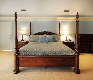
Another guest room we worked on, by adding a canopy to the existing bed, we gave focus to the room.

Blues are a popular choice for bedrooms because they can be calming, moody, masculine or cheery.

This bedroom was done in partnership with another Interior Designer, Catherine Johnson. I loved all the textures that we used in the bedding.